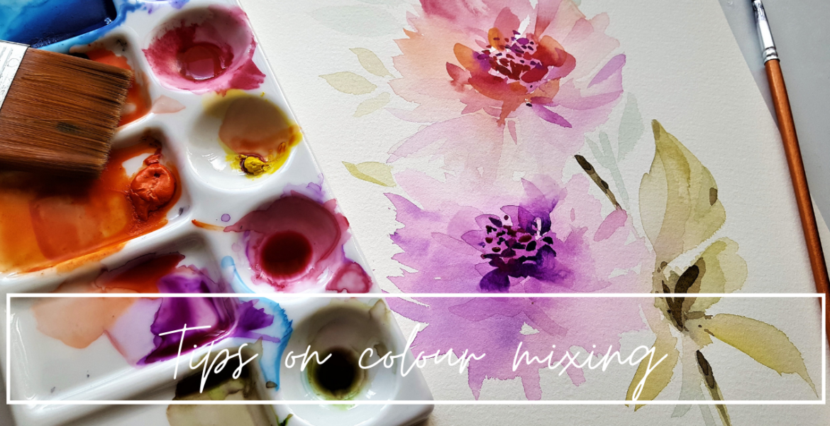
Tips on colour mixing
My tips on colour mixing.
For years, when I used watercolours, I was always disappointed with results. Everything has this dull muddy appearance, and I was unsure why.
At high school we were taught colour theory. There was the basic colour wheel, what to mix to make other colours and all about hues, tints and shades. We mixed black with the colour to make shades.
We also had paint pans of around 12 colours. I was good at art, and interested so they either didn’t cover colour theory enough, or I wasn’t listening. And if I wasn’t listening, I can be certain the ones who didn’t enjoy art were definitely not listening.
By the time we were in Uni, all that knowledge was meant to be a given. And I managed well, mixing pre made colours to make good ones. Acrylics it worked fine, but with watercolours it was still much of the same. My greens were always olive tones, and browns. Great for Olive trees or Gum trees I guess! Ha ha
Turns out, there is an art to it, and its really important!!! It has helped me MASSIVELY in recent years and changed my paintings from dull to vibrant overnight!
So here it is… on a basic level…
The colour wheel is made up of our 3 primary colours, red, blue and yellow. From these, you can then go onto make your secondary colours. (2 primaries mixed together, orange, green and violet)
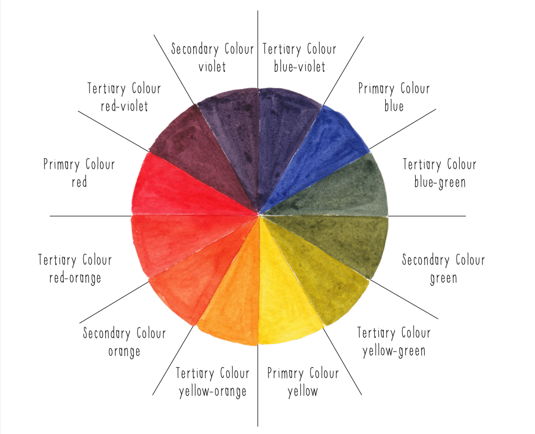
From here again, you can make tertiary colours, which are 3 colours mixed together. Easy right!
Not so much! Did you know there are in fact a few different variations of the primary colours, and these can make all the difference to mixing your secondary colours.
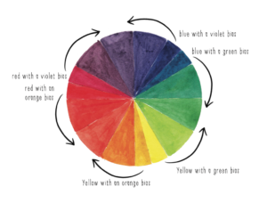
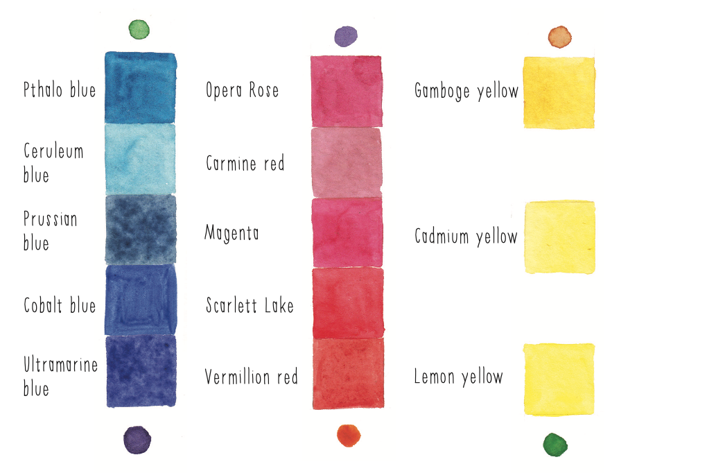
Lets take the reds. There are two types of red pigments. Ones that have an orange undertone and those that have a violet undertone. This is usually called the bias.
Reds with an orange bias are
- cadmium red
- Scarlett red
- permanent red
- vermillion red
- winsor red
Those that have a violet bias are
- magenta
- rose madder
- Carmine
- Alizarin crimson
- Scarlet lake
- Opera rose
Lets move onto our blues. Ahhh I love blue!
Here we have options of blues with a green bias and those with a violet bias. Have you noticed that the bias’s are the secondary colours near them on the colour wheel?
Blues with a green bias are
- Phthalo blue
- Prussian blue
- Cerulean blue
- Intense blue
Blues with a violet bias are
- Cobalt
- Indigo
- Ultramarine
- Victoria blue
- Brilliant blue
And now the yellows
Yellow with an orange bias
- Aurora yellow
- Brilliant yellow
- Cadmium yellow medium and deep
- Gamboge
- Lemon yellow deep
Yellows with green bias
- Cadmium yellow
- Lemon yellow
- Primary yellow
- Permanent yellow
- Winsor yellow
So now we know which yellows have which bias, we can then be smarter at mixing our colours together.
When we want to create a muddy, or olive tone, we mix colours with opposite bias’s.
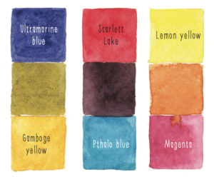
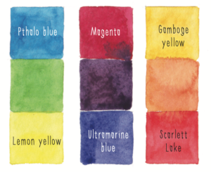
So we would mix ultramarine blue with perhaps a lemon yellow deep to create really olive green. Changing the yellow to cadmium yellow would create a slightly brighter green.
Or mixing a warm red, like cadmium red with a cool blue like Prussian blue, would create a dusky violet, rather than a bright one.
So to mix the brightest violet, we would need to use a red and blue with biases, which lean into each other.
Scarlet lake (violet bias) with ultramarine (violet bias) will create a lovely violet.
The same with a phthalo blue and a lemon yellow… wow, that’s a bright green!
Go on, have a try at mixing your colours and seeing the differences you can make using this knowledge. Share your artwork online tagging @iampoppydesigns as I’d love to see how you go!!