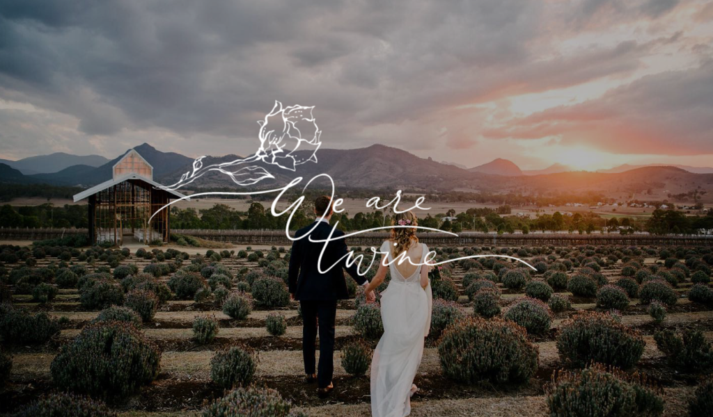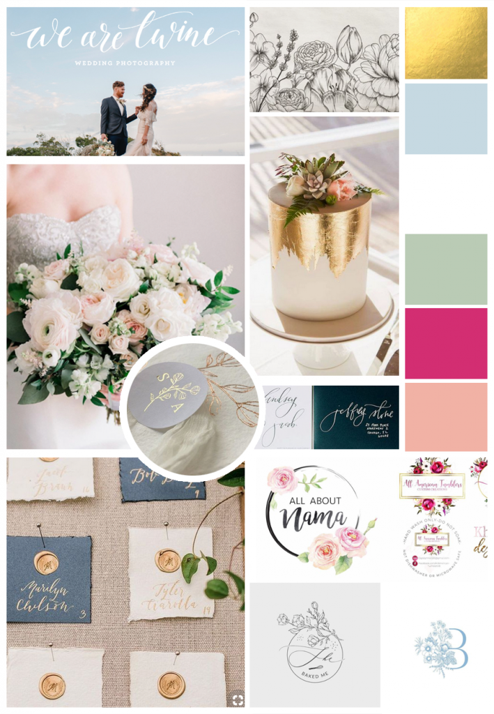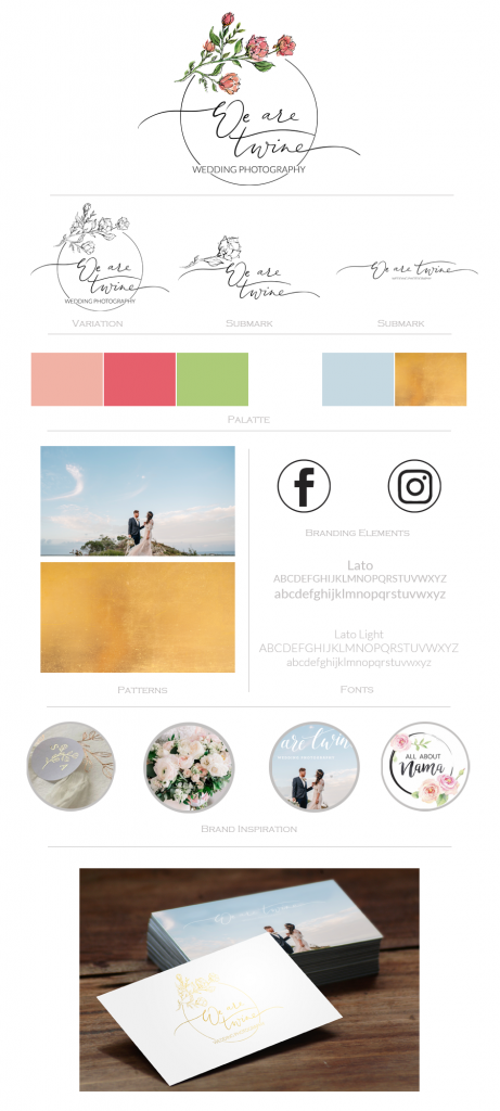
Amanda from We are Twine contacted me for a rebrand. She loved her previous logo, with the cursive text, however she wanted something a little extra to it. Using the florals was something she was keen on, and I experimented with a few different versions and types of flowers before we settled on this design. I love creating logo’s within circles. The circle is often used in a logo to represent unity, commitment, love or community, which was perfect given its a wedding photography business. It is also viewed as a feminine aspect of design, which again was part of the original brief. I created a few different versions for her to use, some in colour and some in black and white which will be perfect for stamps and watermarks.


