I was thrilled when award winning florist contacted me to create her new logo. I have been a fan of Julia Rose’s work for many years as she is so vibrant, energetic and creates really out there pieces which are so inspiring.
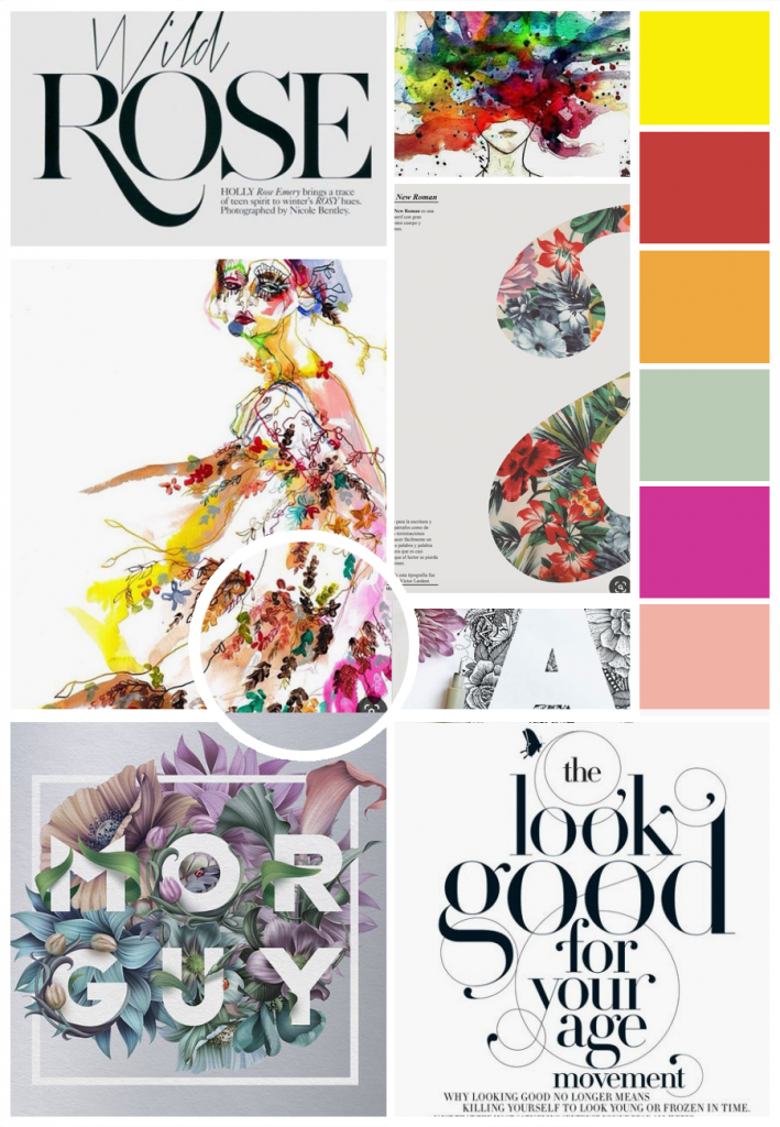
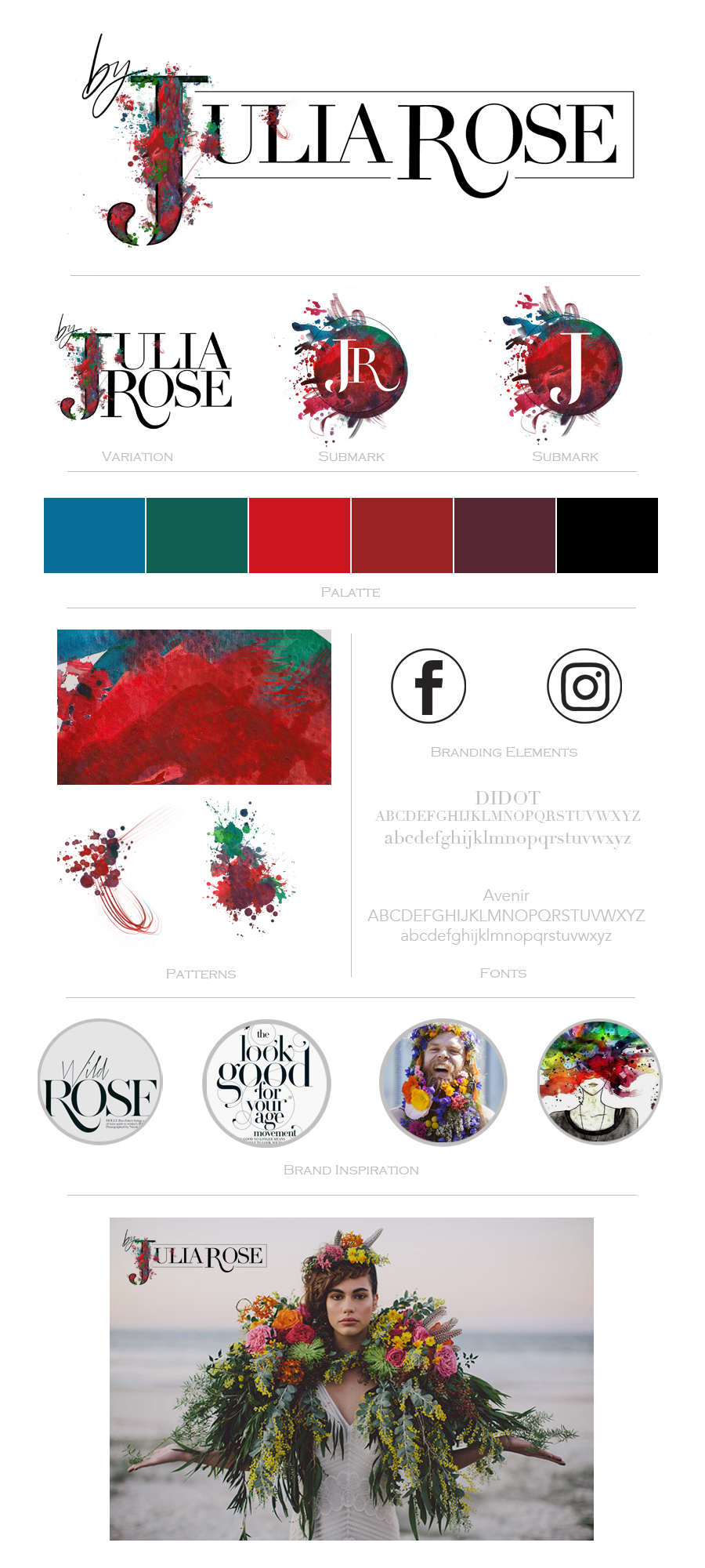
We quickly had a meeting where she expressed the need to capture this in her logo. She wanted the logo to be wild, expressive and full of colour. Although I try to avoid creating too much colour in a logo, we agreed it would be amazing to capture her essence with those bursts.
After much design concepts and tweaking, we had a logo! yay… success. It was just what we had imagined, and both were so happy!
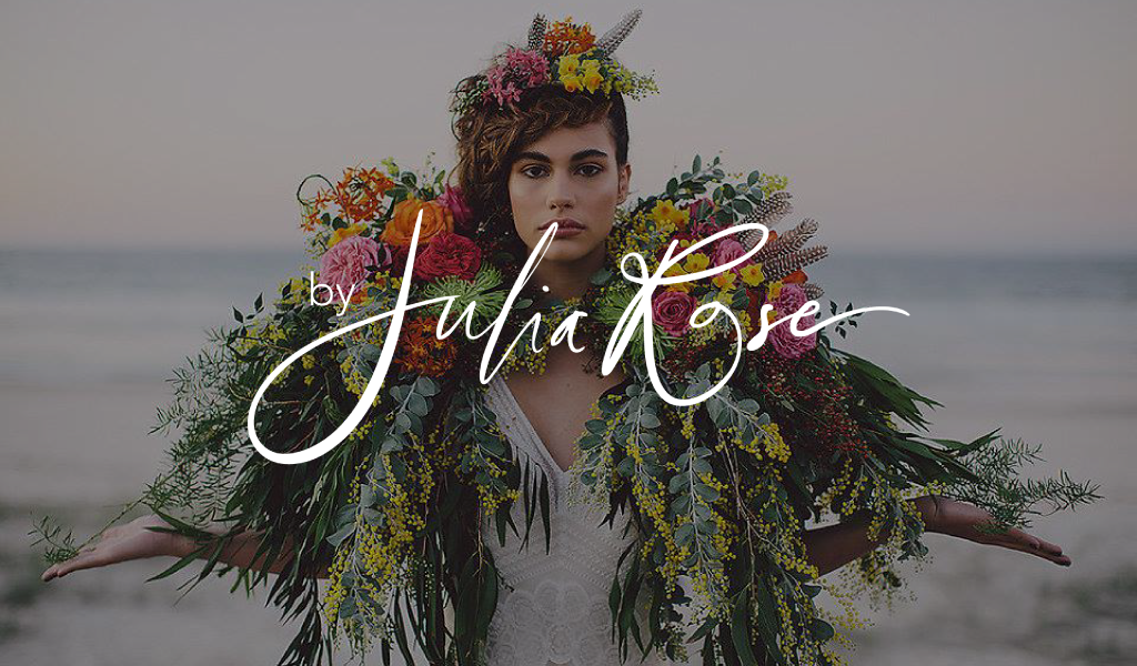
However once she started to use it on her images, it got lost. Her photos are so full of colour themselves, so full of florals and details that all the elements of the logo got lost. I found this too on my end, when putting together my branding ideas with it.
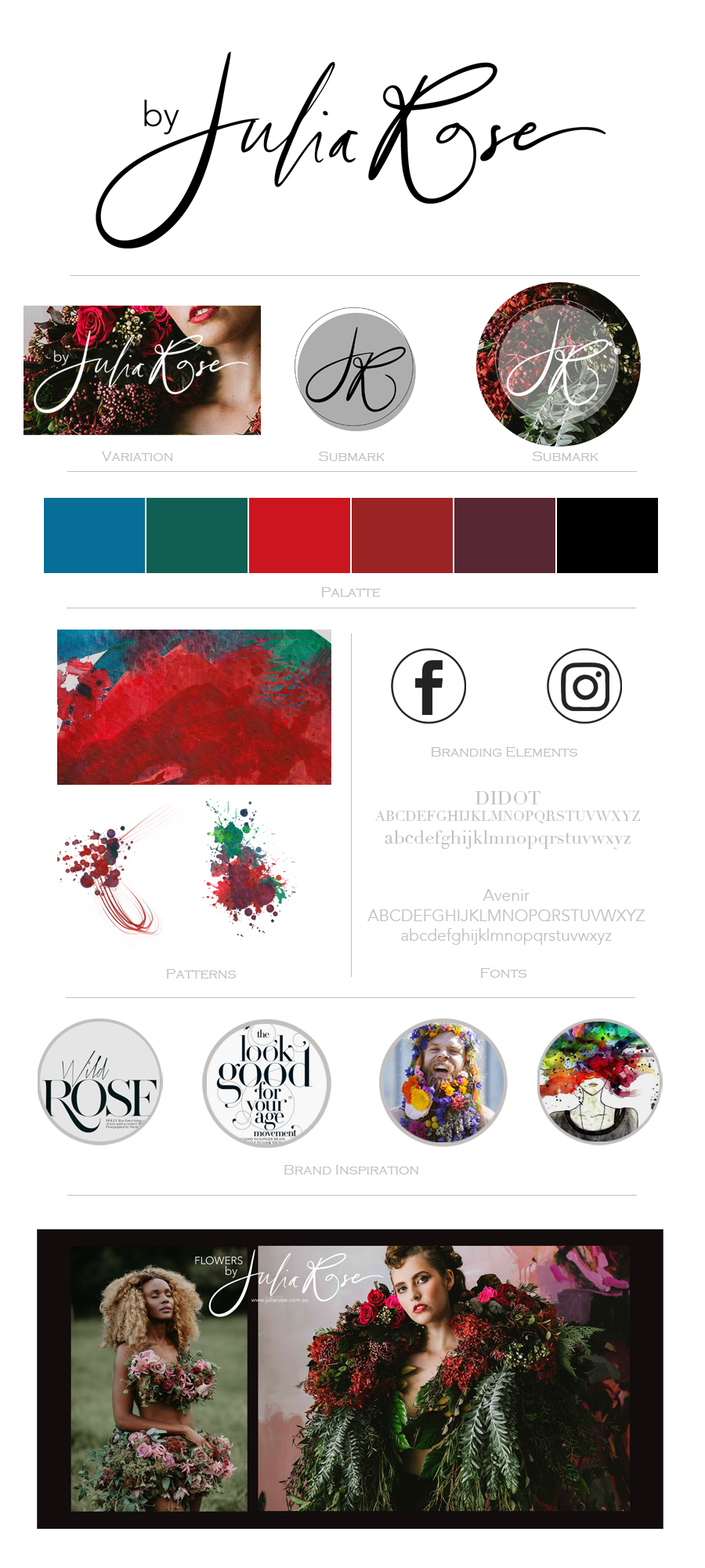
So… we started again!
I’m so pleased with how the amended design turned out. Its so simple, yet the handwritten text is wild and expressive, with a very simple ‘by’ so that she can team it with her different areas of specialties. Yay… we have a new logo for Julia Rose!!


