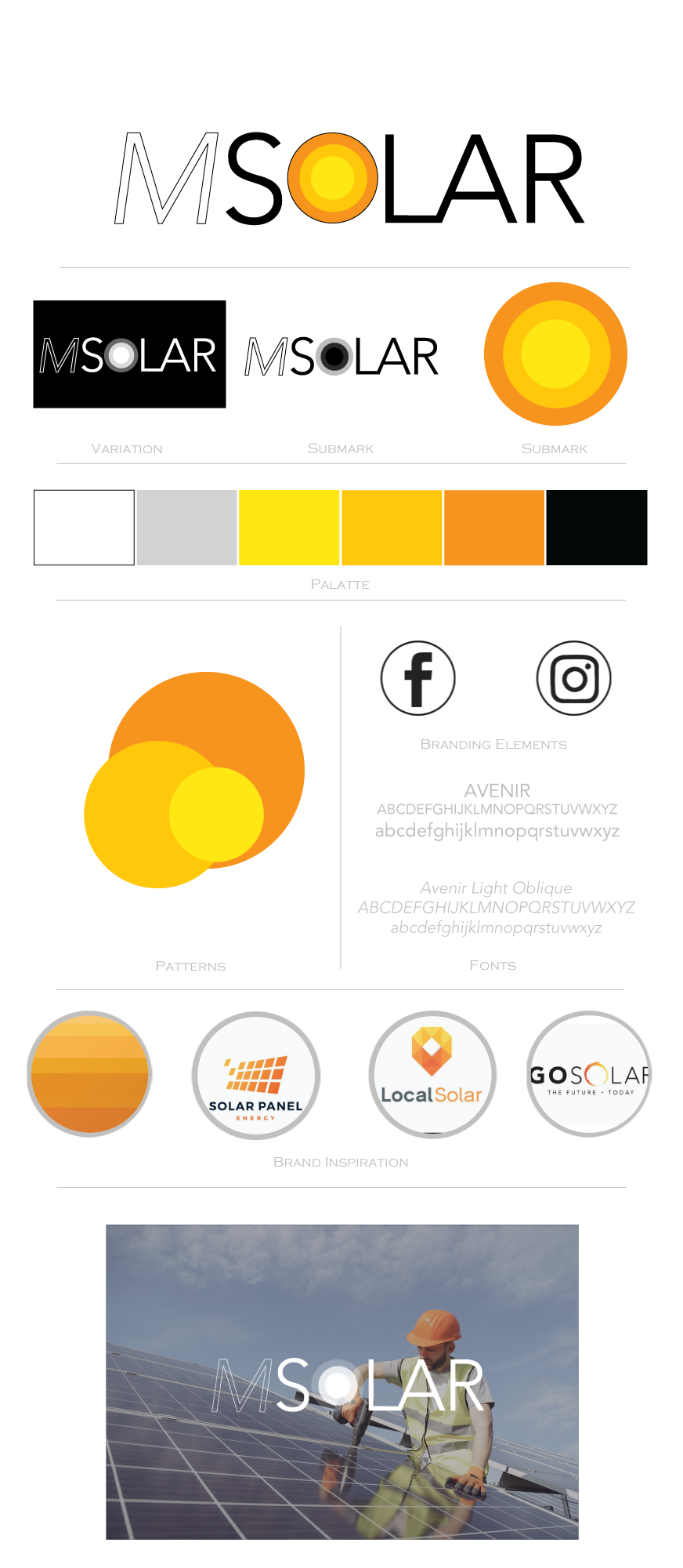
Stepping more into the corporate world, I was asked to create a logo for a Solar business new to the market.
The owner had previously owned a similar business and wanted the style to be similar, with a simple bold logo. We explored some images that caught their attention, with the colours or orange, red and yellow. The sue of the sun was something we looked at, but didn’t want to create anything too literal, but rather keep it much more basic with the emphases on the word rather than an image.
I’ve created something I feel works really well, using the name as one word, but distinguishing between Solar and his initial M with a hollow font, and then adding the sun image into the O, so it keeps it super simplest effective.
By also changing the opacity of the white rings in the white version, it keeps the feel of it as its transferred from colour to black and white.
Awesome!!!